The Challenge
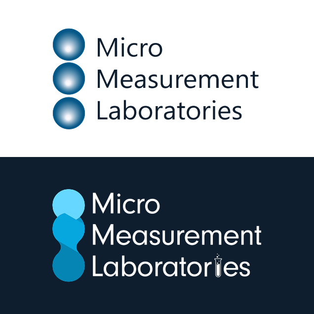
We didn't want to stray too far from the original structure of the current MML logo, so instead, we enhanced it and added unique elements that would brighten it up and modernize it to fit into the entire Gillson Sciences brand.
Our Solution
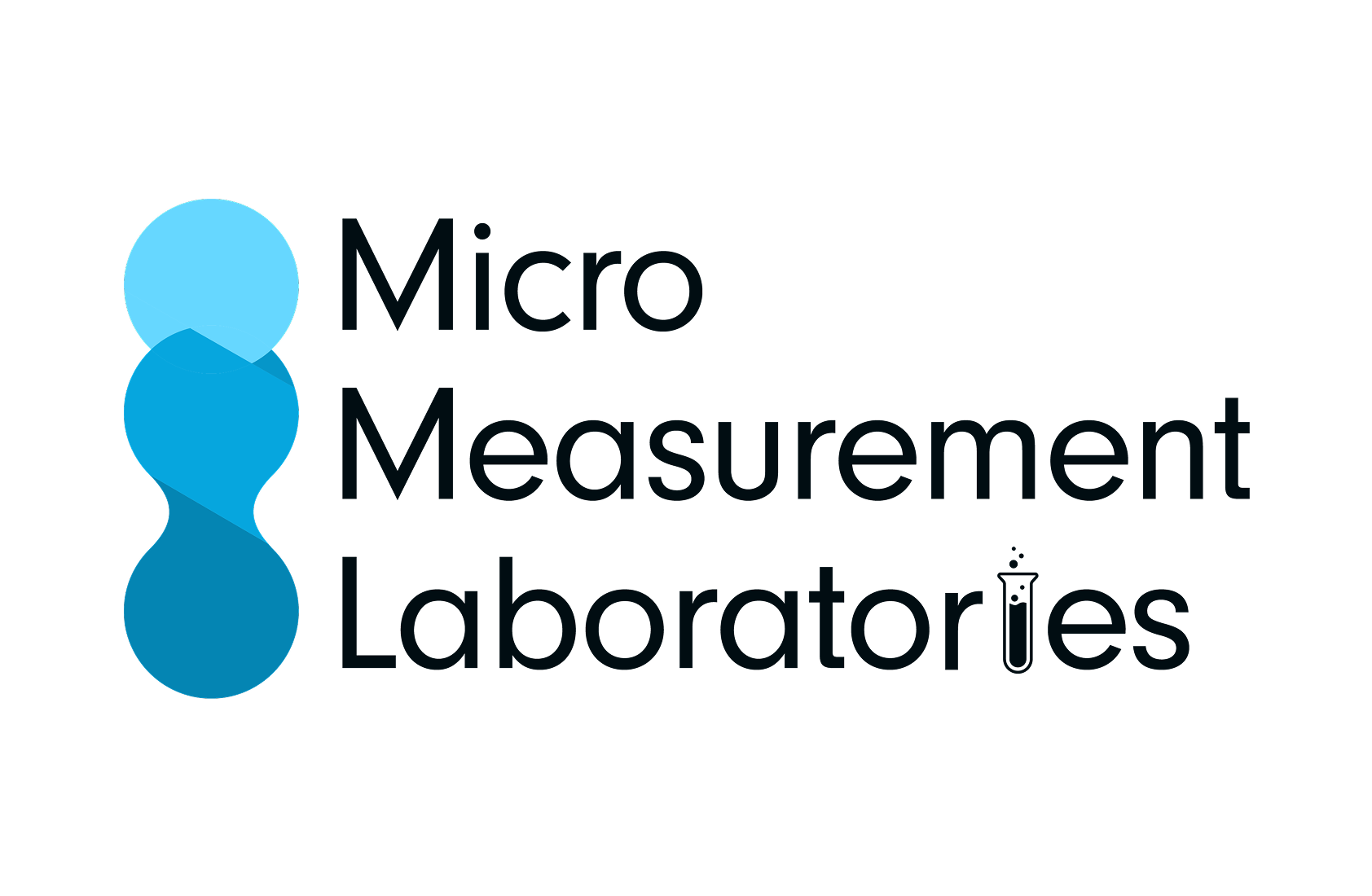
We landed on a crisp, clean design in both a light and dark version that incorporated the lab element—the tube—and added droplets to replace the original dots within the logo. We found this to complement the original structure of the logo but add an element of playfulness.
The Results
The final result was an exciting new logo for MML that went over extremely well with their entire team. This logo design not only proved to be a much-needed experiment for the brand, but it also lent itself to be another critical aspect of the entire Gillson Sciences brand development.


A note from the designer
I knew I wanted to keep the original structure of the logo, as we didn't want to move too far away from the original design; however, being that we had just designed the entire Gillson Sciences brand, and MML is under that umbrella, I felt it would a perfect time to play more with a similar color palette and modernize this logo to blend in well as a division of Gillson Sciences.


Let’s Build Something Great Together
Looking to elevate your brand, website, or marketing strategy? We’re here to help bring your vision to life with innovative design, powerful technologies, and proven strategies. Tell us about your project, and let’s get started!